Rebrand break-down
- Ellie

- Mar 28, 2022
- 3 min read
Updated: Sep 8, 2022
I thought I'd share the process of my recent rebrand and how I developed it into the final branding.
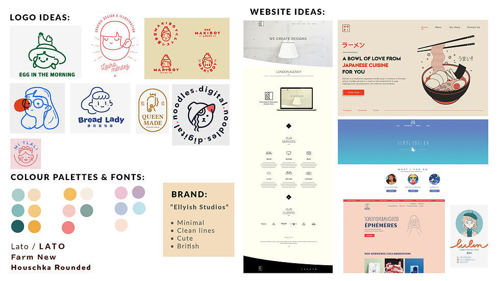
A re-brand is something I've wanted to do for a few months now, it was one of my goals for 2022. I liked my old branding, but I feel like the more I've developed and improved, the more my old branding just didn't reflect me or my style of design anymore. I first started with research aka. a lot of mood boards. I find anything can be inspirational, it doesn't have to be just logos or website layouts. I found things like menu's really inspiring for this which let me to finding these cute, face logos. Pintrest was really handy for this as I could pin all the images I liked together in one board. Of course I also researched and looked at different fonts and colour palettes too. For fonts I used Adobe Fonts, that way I know I'm using a font that is license free. For the colour palettes I used Coloors, it has such a variety of palettes on there! I have to admit it took quite a few boards of ideas until I finally landed on something I really liked. This was more of an abridged break-down:

Now it was time for the Logo. I wanted to get this sorted with a colour palette and font before I started anything else (like website design, social media graphics, invoice template, Etsy listing images etc.) I knew I wanted to have a face as the logo but I wasn't sure on how I wanted this to look. A good technique for something like this is a quick sketching exercise. Grab a pen and paper and spend a minute on each sketch. Each time you look at the last and try something different, or improve on something you like. You should never go with your first design, even if you think it's great. It's good practice to do a few different sketches and designs before settling on something.

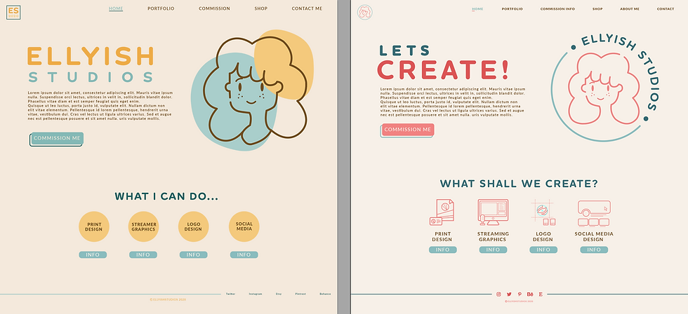
I didn't have the final one yet but I had elements of a few I really liked. I drew a few different versions in Illustrator which I used in the next step. I weirdly started with my website layout and design. I wouldn't recommend this but for me it was something I had been putting off for months and I wanted to "rip of the bandaid" as it were & finally start working on it. Even though I had a colour palette and font I liked I still experimented at this stage. It was really handy seeing them used on something like this and it helped seal the deal on which one I was going to use.

I feel with the image above you can see how the layout and colours of the website came to be what it is today. I'm really quite proud of the website as it's something I never actually was taught when doing my degree. We did a lot of other design but websites were something we never covered sadly. There's a lot of thought not only about the look but how the user actually interacts with the website too. From there it was really easy to work on other elements too like social media graphics, my Etsy shop, basically anything that needed the branding on.
...and here is the final result! I am so happy with how it turned out and I hope you like it too. I hope this was a helpful insight into how I create a brand and how I create logos.


Loved seeing the process, thank you!